

The Challenge
Concept project: a self-initiated brief, not client work. Solis is a fictional medspa I created to build a complete brand system.
Most medspa brands look identical — blush tones, a thin sans-serif, a stock lotus. The brief for Solis called for something that felt credibly medical without reading clinical, and warm without sliding into the generic spa aesthetic that saturates the market. The real constraint: build a mark that communicates precision and personality without relying on any literal symbol. No face, no leaf, no droplet.
The Solution
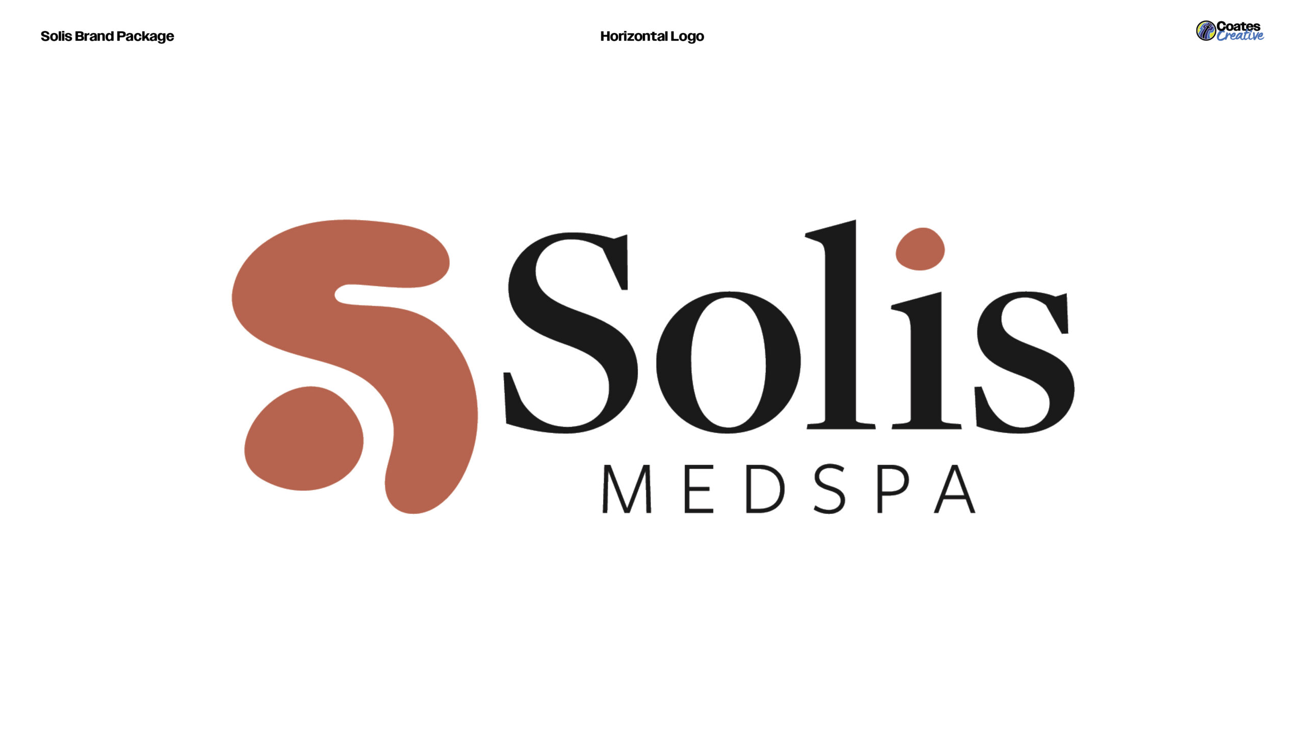
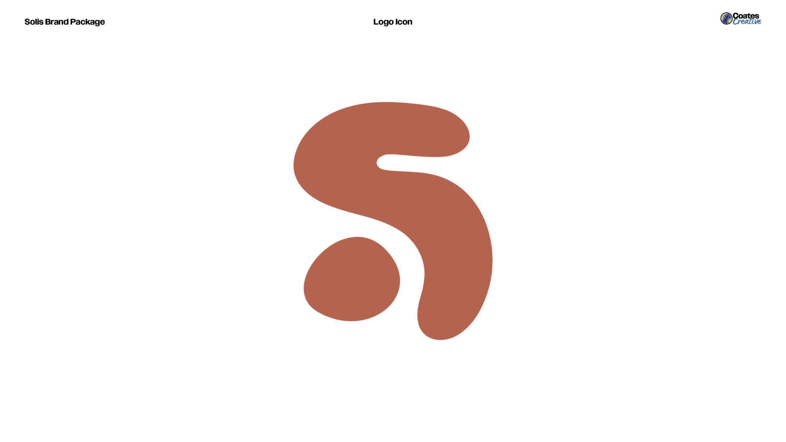
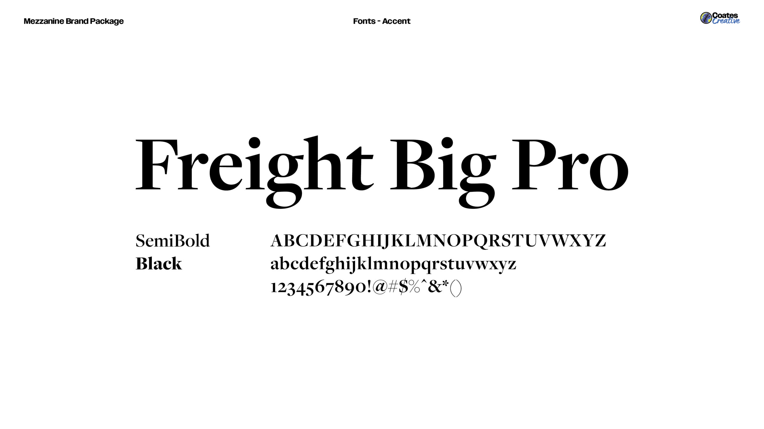
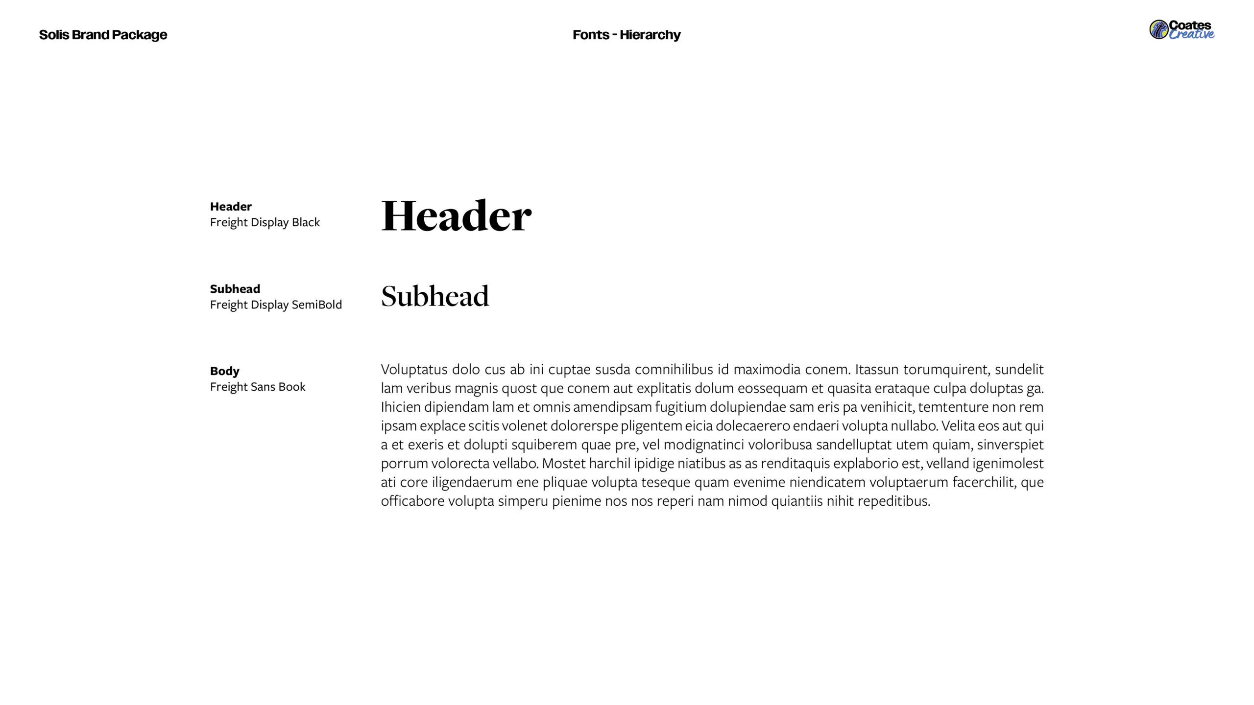
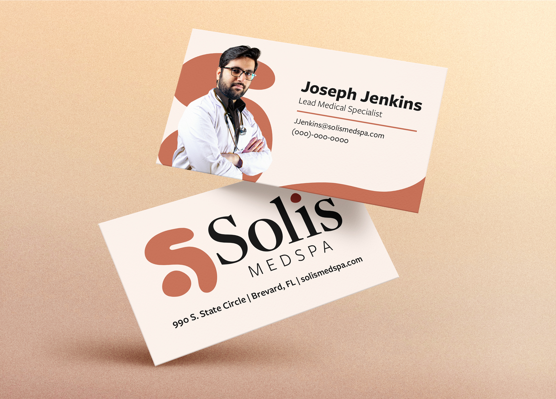
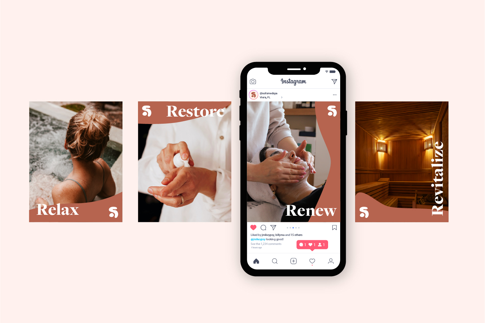
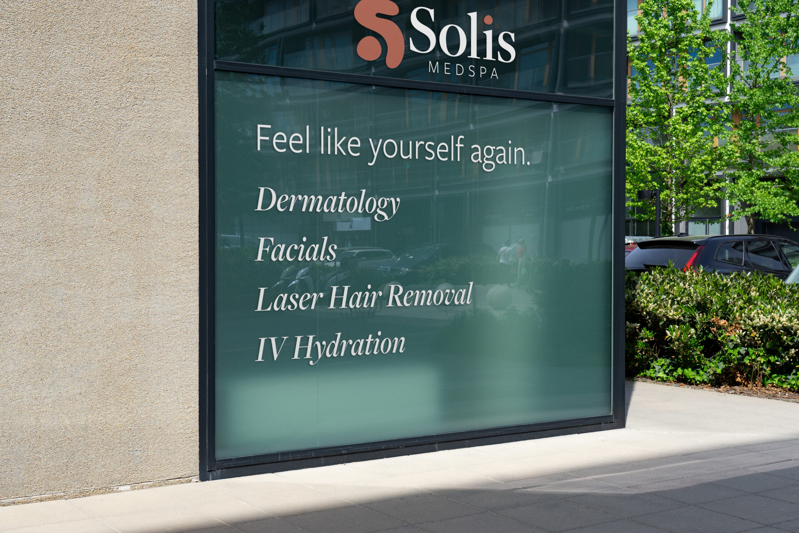
The Solis mark pairs two abstract shapes — one with the fluid suggestion of an S, one a slightly imperfect circle — creating an O-like relationship that’s legible enough to feel intentional but loose enough to stay interesting. That imperfect circle reappears as the dot of the i in the wordmark, tying the system together without forcing it. Freight Display handles the name; Freight Sans carries the descriptor. The palette — near-black, warm cream, and a muted terracotta — avoids every color cliché the category defaults to.