
The Brand
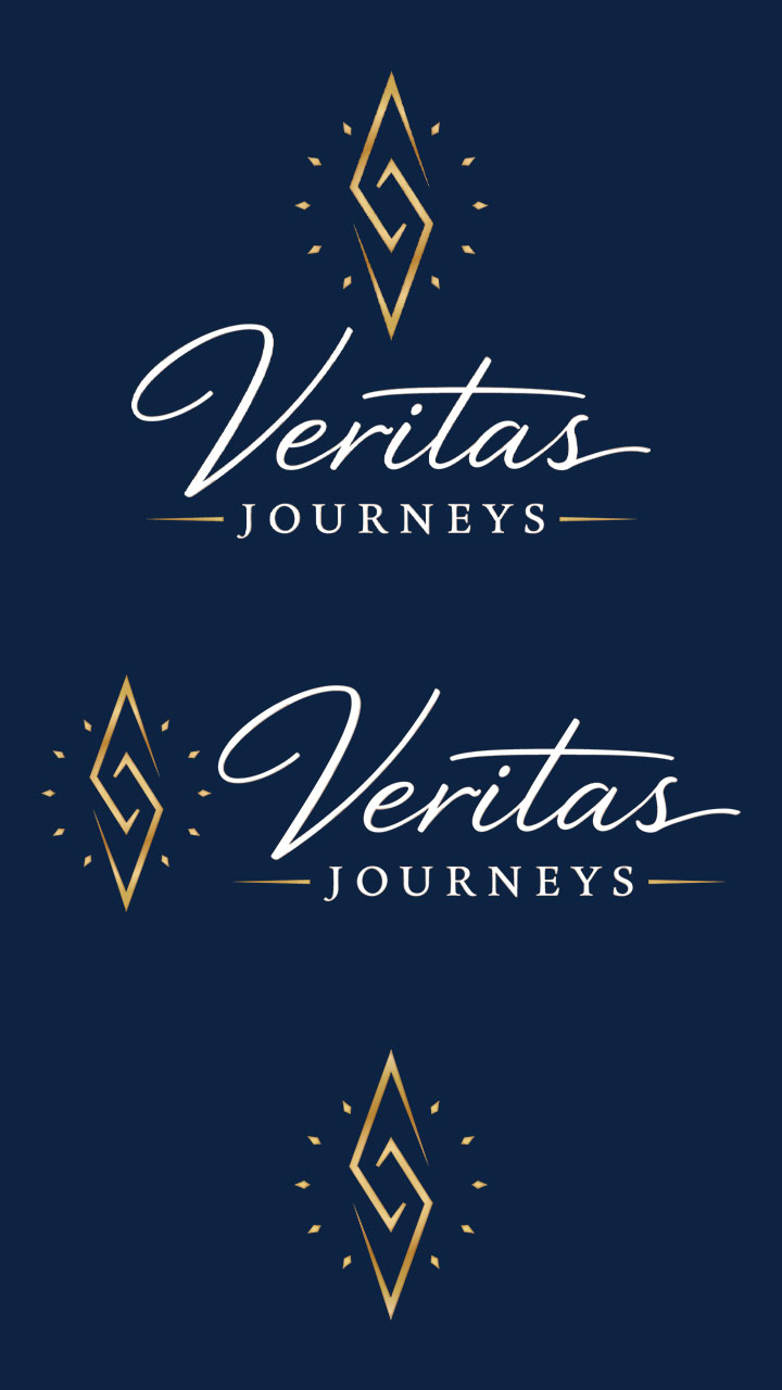
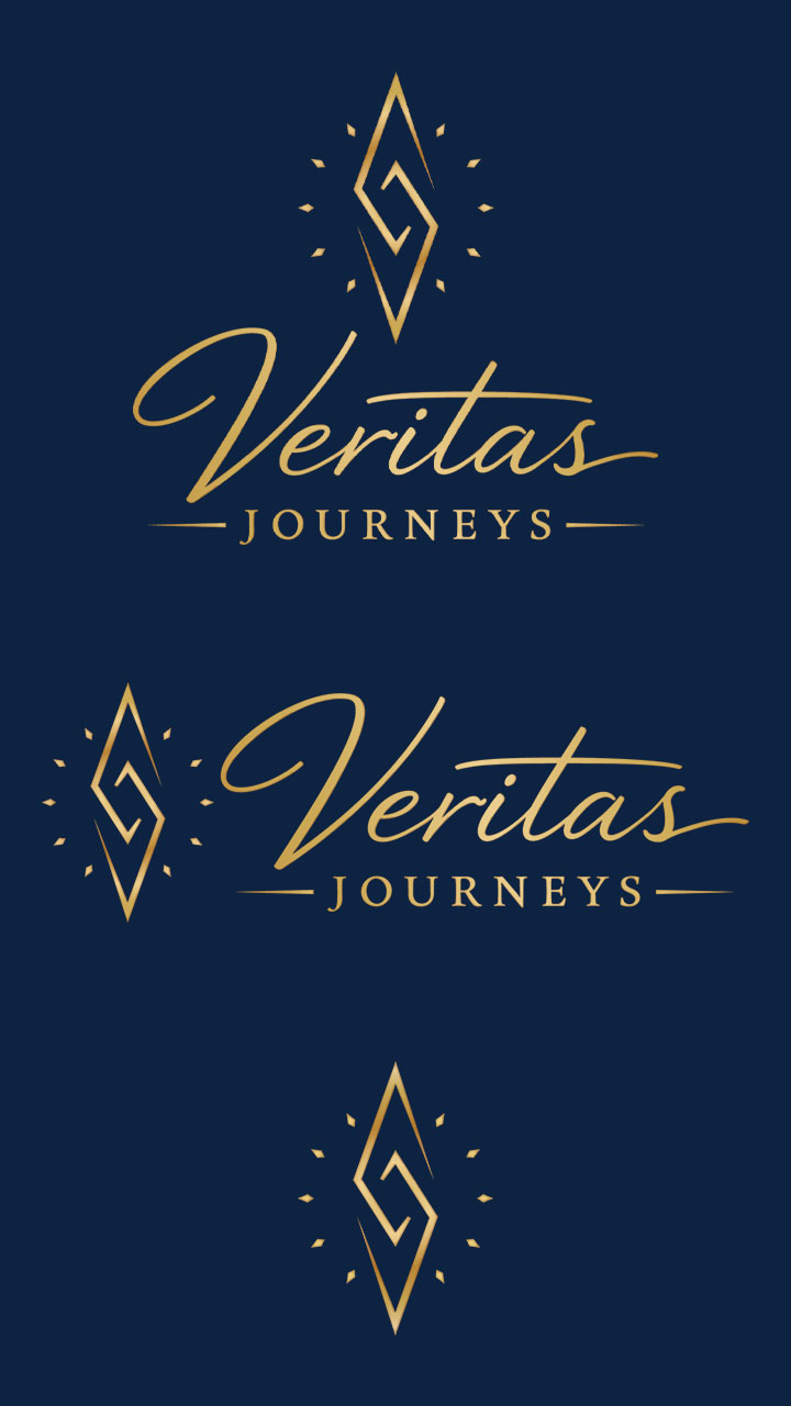
Veritas Journeys is a travel agency built on the belief that a great trip starts with someone who genuinely knows where they’re sending you. The name says it all — veritas is Latin for truth, and that commitment to honest, knowledgeable service is the foundation of everything they do. Their visual identity needed to reflect that same sense of confidence and direction: clean, refined, and purposeful. The compass mark at the center of the logo isn’t decorative — it’s the whole idea.

The Problem
Veritas Journeys came to me with a logo concept they’d generated using AI. They liked the direction — a compass mark paired with a clean wordmark — but the file wasn’t usable. AI-generated logos aren’t built for production; there’s no vector geometry, no clean paths, no way to scale them for print without the whole thing falling apart. They needed the concept professionally reconstructed in Illustrator and properly prepared for every application: business cards, print materials, digital assets, and everything in between. The idea was solid. It just needed to be made real.
The Solution
I rebuilt the logo from scratch in Illustrator, tracing and reconstructing every element as clean vector geometry. In the process, I made one refinement to the mark itself: the original compass notches were small squares, which felt generic. I changed them to diamonds — the same shape as the compass needles — so the mark reads as a cohesive, intentional object rather than a collection of parts. Working alongside the brand’s web designer, we also refined the color palette, landing on a deeper navy and a warmer, brighter gold that gave the mark the weight it deserved. Final deliverables included a full color version, an all-gold variant, and a white-text version for use on dark backgrounds — each exported and production-ready for digital and print.